
A centralized place for college students to find the best local deals and discounts.
MY ROLE
UX/UI Designer
PROJECT DURATION
16 weeks
READ TIME
5 minutes

─── THE PROBLEM
Although most college students are eager to save money, finding and taking advantage of available discounts can be challenging. As a result, many miss out on valuable opportunities to save and enhance their college experience.
─── THE PLAN
01. RESEARCH
02. IDEATION
03. USABILITY TESTING
04. FINAL DESIGN
Perq was designed by me and three fellow classmates at the University of Miami, inspired by our shared struggle to manage spending as college students. This common pain point sparked the idea behind Perq. We began by conducting user research to understand the most common frustrations among our peers. We used surveys, interviews, and thorough market research to inform our process.
The Most Common Concerns
Existing discount apps fail to provide a simple solution to solve these issues. Gathering these common struggles from real students helped us set a clear intention on what Perq would solve.
User Persona

Market Gap
Most existing discount apps lack a dedicated focus on the college student demographic, offering generic deals that often require unnecessary memberships, don’t verify student status, or overlook proximity entirely. There's a clear gap in the market for a clean, intuitive platform that curates verified, student-exclusive deals, especially ones tied to a user's specific campus or location. What’s missing is a local approach that not only centralizes ongoing student discounts but also allows users to share, rate, and post their own finds in real time.

How Perq Stands Out

Perq offers a simple and intuitive user flow designed to make finding and using student discounts effortless. New users can quickly verify their student status with ID or email, and create their personalized profile.
Once set up, students can immediately browse current promotions in their area or search for specific deals. Each listing clearly displays key details such as location, business hours, distance, and eligibility requirements, ensuring students have all the information they need at first glance.
After discovering a deal, users can redeem it in person or online, share it with friends, and leave feedback about their experience to guide fellow students.
The sketches for Perq outlined the main features we wanted to include in our app, such as student credential verification and the ability to browse deals through scroll, search, and map functions.


For the initial Perq wireframes, we aimed for a sleek, streamlined design that supports fast and easy access to key features.
The home screen highlights the most popular current deals in a scrollable list. A fixed navigation bar keeps key features within reach, while the search and filter tools allow users to narrow down deals based on category, distance, and eligibility.
For a more visual experience, the map view displays all available discounts in the area, with tappable pins that let users quickly explore each deal.
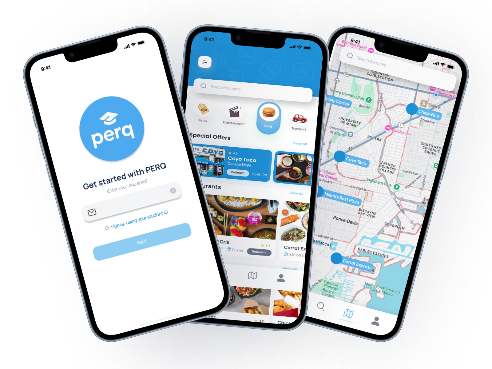
The Perq mockup brings the app’s core features to life with a clean, modern interface that balances functionality and visual appeal. Each screen allows students to explore local discounts, filter by preferences, and view detailed deal information in both list and map formats.
The design emphasizes clarity and accessibility, with consistent branding, intuitive icons, and thoughtful spacing that guide users naturally through the app. From the home screen to the deal detail pages, every element is crafted to encourage students to interact, share, and save.

Our team conducted usability testing with eight students from our university to better understand how intuitive and effective our app design was.
Each participant was given a set of tasks to complete, such as browsing local deals and attempting to redeem one, while we observed and took detailed notes on their experience.
Our usability testing revealed a few key areas for improvement:
Receiving these insights from outside perspectives was extremely helpful in guiding refinements for our final design.
After implementing the findings from our usability testing, the final design of Perq reflects a balance of simplicity and bold visual identity. Our primary color, a cool blue, was chosen for its vibrant, energetic tone that resonates with student life while also establishing a sense of trust and credibility.
.png)
%20copy.png)
%20copy%202.png)
.png)
%20copy.png)
%20copy%202.png)
%20copy%203.png)
%20copy%204.png)